

When you hire a consultant or other specialist and the deliverable is an intangible, how do you “see” what’s invisible?


Frequently, our work for clients involve intangibles – for example, integrating an application or performing a business process review. Boiled down to their essence, what these two types of projects deliver are basically “bits and bytes” and “flowchart symbols.” Moreover, these projects can be very large and complex, spanning many months and many hours of work.
We never forget our work helps our clients achieve their business goals. My objective is to ensure our clients trust us to have a clear view of the overall goal and to make consistent progress toward that goal. This can be hard to do, especially when our engagement outputs are – to an end user – “invisible.” What can I do to help clients see the invisible? Over the years, I have discovered that turning the “invisible” into a doodle or similar visual is usually the solution.
To illustrate, I'd like to share a collection of some of the more interesting techniques I’ve used.
Project Roadmap
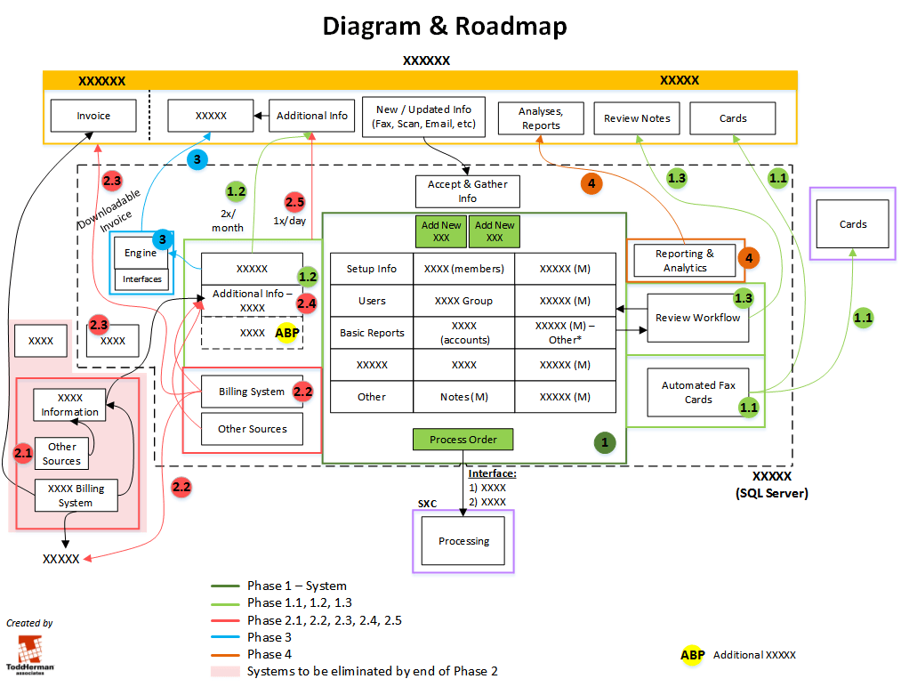
I created this diagram to help illustrate how the various features in Phase 1 of the project laid the groundwork for what would ultimately be fleshed out. I’m especially proud of this Project Roadmap – so much so, I described its evolution in Going from Doodle to Client Roadmap.
Post-It Doodle
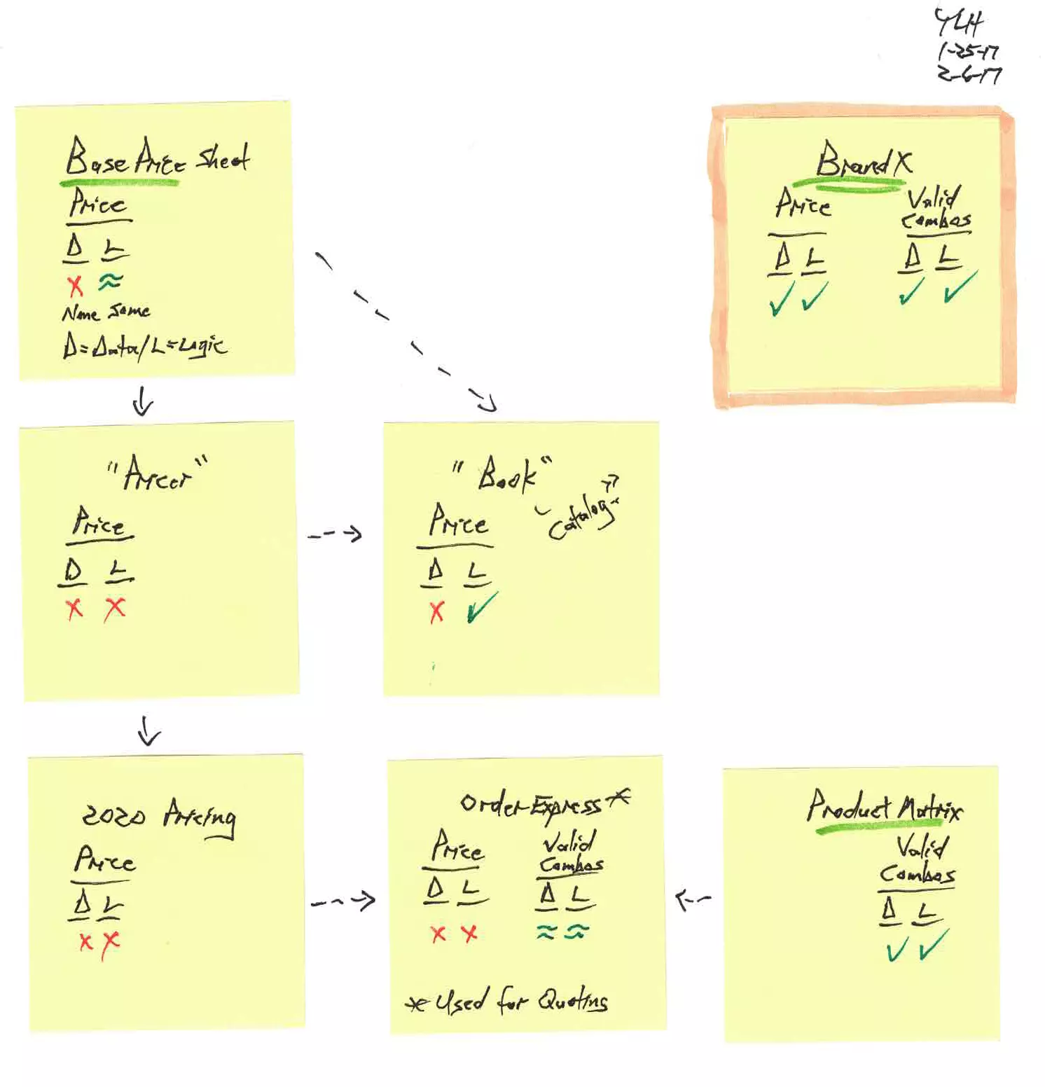
This Doodle represented my initial attempt to catalog ALL the sources of pricing information – and the numerous valid combinations of multiple options – in use at this client. Each yellow Post-It represents one source of information, and my assessment of the information quality each contained. Several arrows depict how information evolved (and not always for the better) as it flowed.
Our end goal is the one Post-It outlined in orange highlighting – an application providing a SINGLE source of complete and accurate information of ALL pricing for ALL valid combinations of options.
I showed this to a company executive over lunch, and he liked it so much, he asked me to scan and send it to him as is – no cleanup needed!
Swim Lane Flowchart
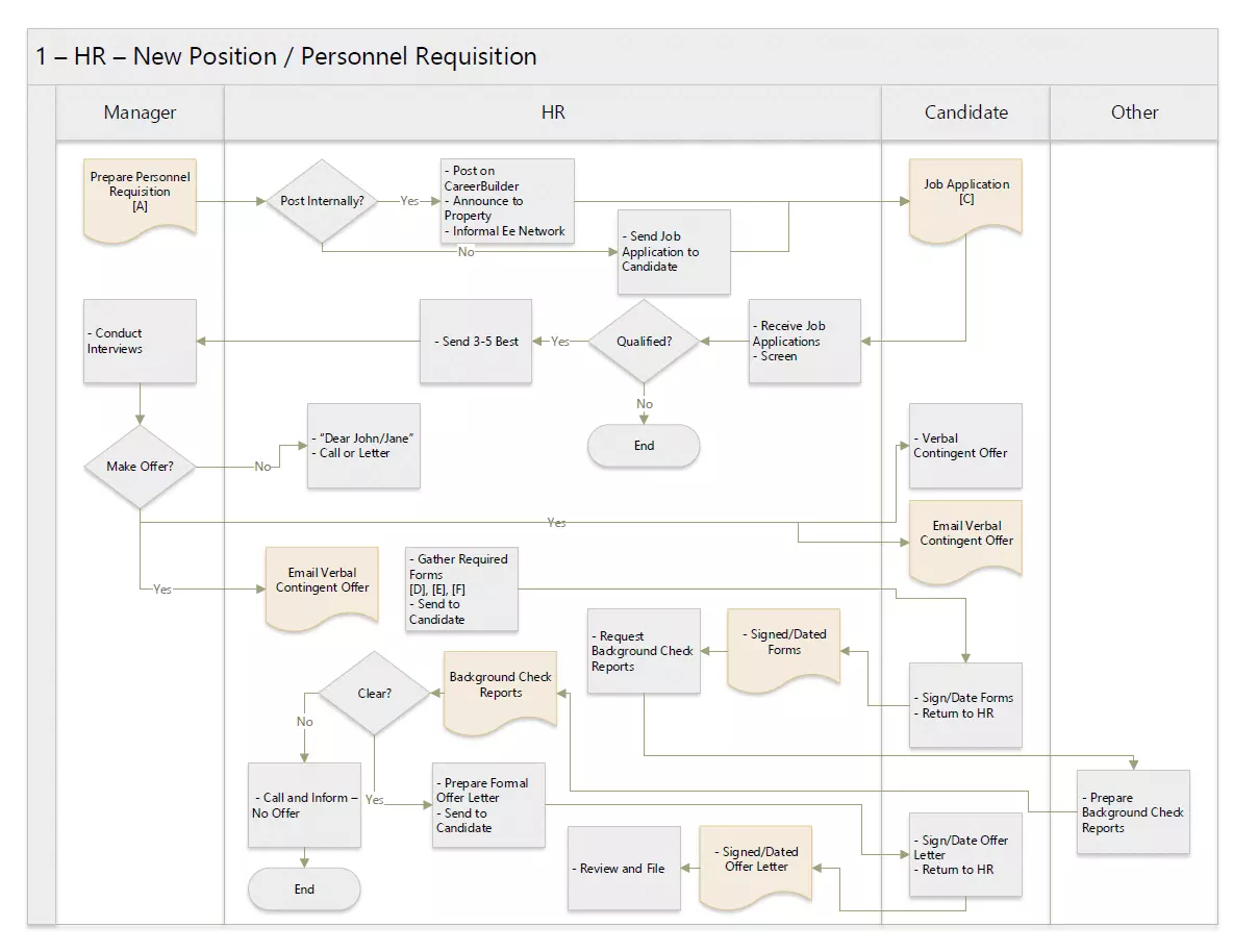
“Swim lanes” – vertical or, in this case, horizontal lines demarcating areas reflecting, say, departments – provide structure to a flowchart, improving information quality and enabling conciseness (since departments need only be specified once, in the heading, for symbols inside a department’s Swim Lane).
Here’s an even more complex Swim Lane Flowchart …
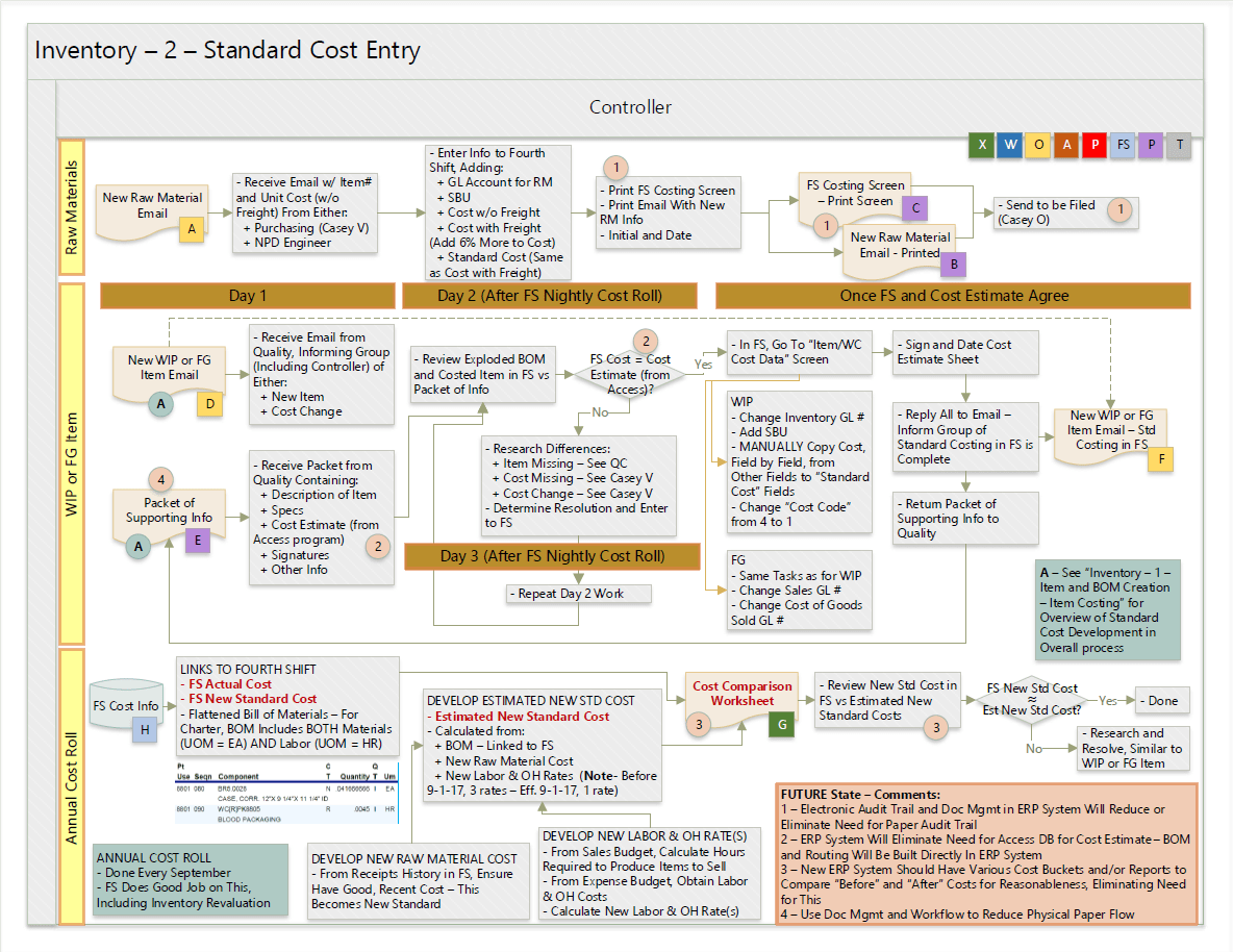
What’s interesting about this Swim Lane Flowchart is just how much information is packed in this one page.
- Documents (tan shading) are uniquely referenced using capital letters, inside color-coded squares reflecting the application which created the document (this legend is near the top-right – green for Microsoft Excel, blue for Microsoft Word, yellow for Microsoft Outlook, and so on).
- Future State Comments are a numbered list in the salmon-colored box at the bottom right, and Processes (grey shading) and Documents affected by a specific change are indicated with the corresponding number, inside a salmon circle.
- Special Notes (teal shading) reflect either General Information on the overall flowchart, or Specific Information (called out via a capital letter in a teal circle) about a portion of the flowchart
Whew – made me tired just describing it!
From Systems to Structured Data to Job Profitability
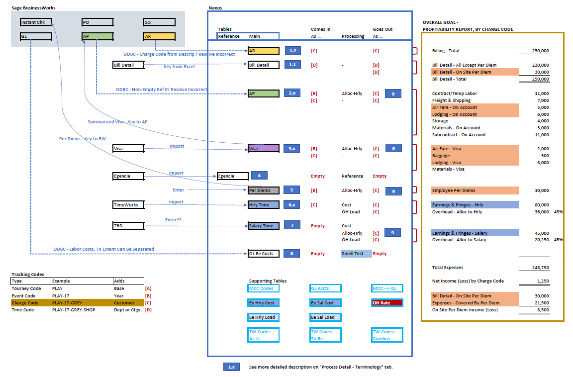
There are three distinct sections of this diagram – from left to right, these are:
- Systems providing the source of various data sets.
- Structured Data showing results obtained by aggregating, correlating, and computing various data sets.
- Job Profitability Report presenting the information company executives and managers wanted for years!
What I like in this visual is that it effectively communicated to our project sponsor how our step-by-step approach would lead to her desired outcome – “I can finally see and understand why we’re doing what we’re doing.”
Good Ol’ Gantt Chart
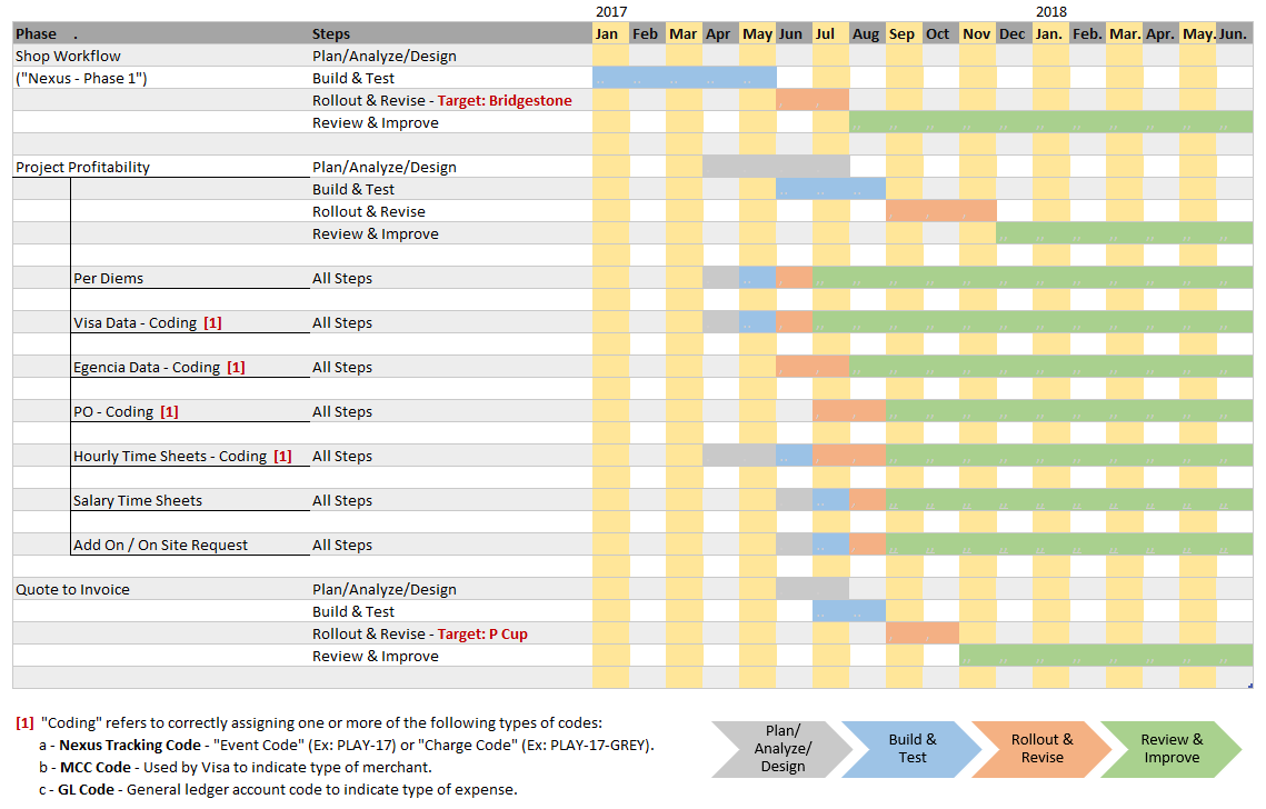
This Gantt Chart accompanied the From Systems to Structured Data to Job Profitability diagram immediately preceding this. Once our client saw "what" and "why" we were approaching things as we were, we also needed to make sure they and we both did our parts to meet the client’s “Go Live” date.
Even though the Gantt Chart is an oldie, it’s a goodie – and continues to be perfectly useful!
Following an Order From Start to Finish
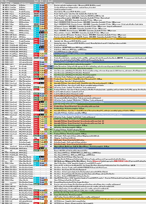
This client's folks were amazed when I first showed them this Excel analysis. Each row represents a unique step required to take a customer order from start to finish, including steps to buy a raw material and to produce the finished goods. (Yes, there are a large number of steps, and this is typical for any manufacturer – as consumers, we just never think about what it takes to make something.)
What’s most interesting is how color coding is used – the first three shaded columns indicate, respectively …
- the system that will process the step’s action,
- the method used to get data into that system, and
- whether an accounting transaction is generated for the step’s action.
The colors allowed us to identify areas to question and simplify, and to pinpoint where special data entry devices would be needed.
Developing an Executive Dashboard
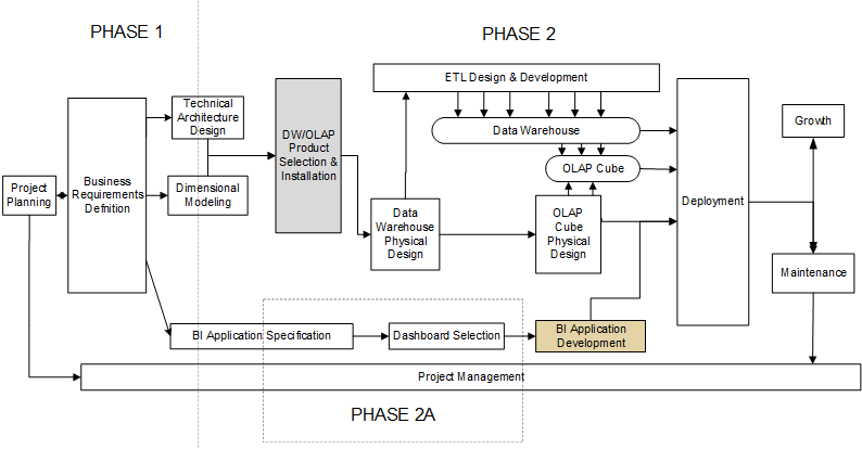
We developed this flowchart to explain to a client why 90% of the cost of developing an executive dashboard is defining data, building a data warehouse, and developing processes to scrub and load data into the data warehouse – all of which are behind the scenes. Our client really only wanted the box shaded in tan, which was impossible to deliver without everything else already in place.
For a more in-depth look at this specific project, you can read our case study Executive Dashboard – The Tip of the Iceberg.
Showing What Was – and Was Not – Going On
When engaged to help a client determine why a particular project went off track, we began by reviewing numerous status and presentation documents provided by our client to find signs of when things began to slip. We did find some tell-tale signs, yet believed we could find better evidence.
We eventually learned the project team members had recorded time by detailed code – however, these codes were used inconsistently over the course of the project. Thus, when we grouped the codes together as best we could, we were able to provide the following big picture view of time spent.
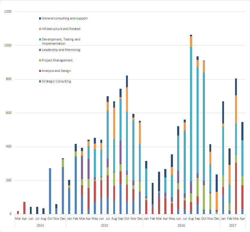
Can you see what happened? Early in 2016, the Development efforts skyrocketed without any noticeable uptick in the Analysis or Project Management (PM) areas. More developers had been added to the project, and this exceeded the bandwidth of the Analysis and PM folks to keep pace. Developers without guidance can be VERY dangerous!
It’s Not Magic – Or Is It?
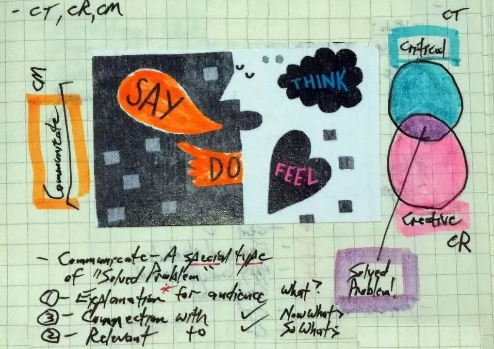
Unlike a magician who WANTS to mislead our eyes and thus create an illusion, we want our clients to see things as clearly as possible. So if you’re faced with a situation where the deliverable appears to be intangible, perhaps you can try challenging those involved to devise a doodle or a visual that makes the invisible visible. All that’s involved are persistence, hard work, and outstanding skills in Critical Thinking (CT), Creative Thinking (CR), and Communication (CM) – and those aren’t magic. On second thought, maybe they are …
Sincerely,

Todd L. Herman